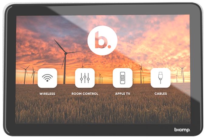
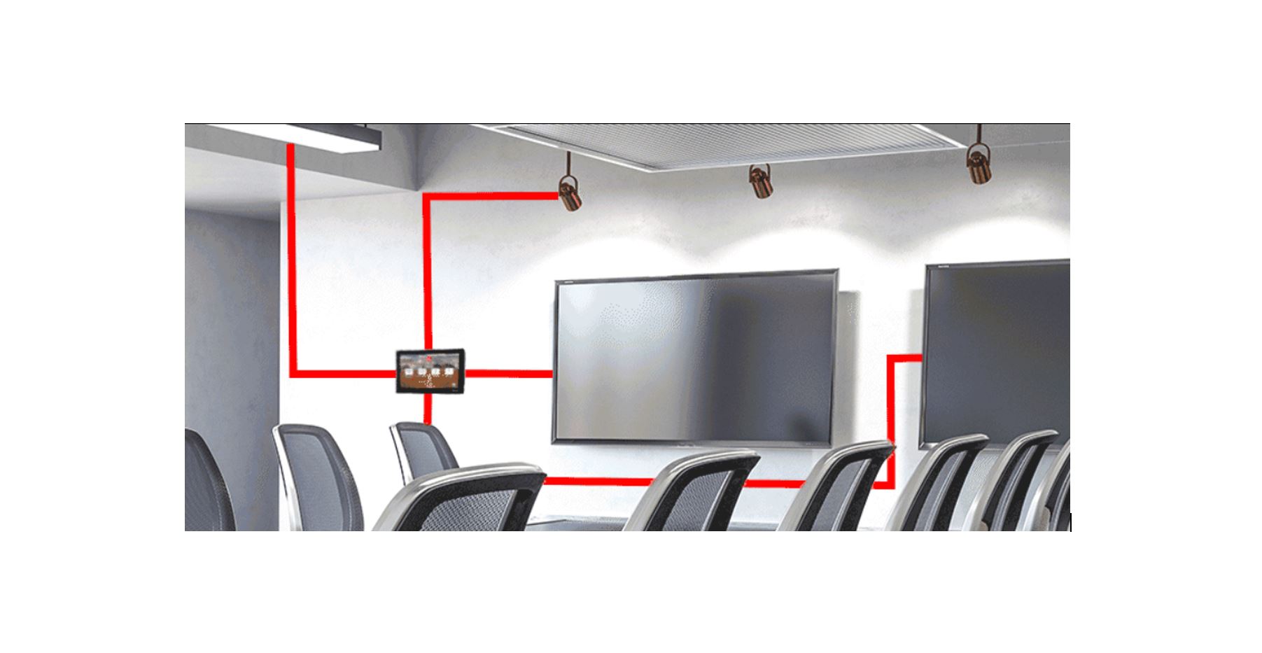
A great touchscreen user interface (UI) should be operationally seamless — but poor design elements can’t be ignored. Here are some tips for creating streamlined and superior user interfaces.
A well-designed touchscreen UI should be:
Pragmatic
The control interface should be designed with its users’ needs in mind. It doesn’t matter how beautiful the interface is or how many functions it has if said functions don’t allow the user to perform their required actions.
That’s why it’s important to take the time to understand the context in which the interface will be used before designing it. In what type of room will it be used? What equipment will be controlled? Who is the typical user? What are the most important functions for that user?
Accessible
Accessibility is somewhat related to pragmatism. An accessible interface means that it is simple and clear enough to be understood and used by different types of users, no matter their technical skills or familiarity with the device. Also, an accessible interface addresses the most important and specific user needs first. That means the most important functions should be accessible immediately, without requiring the user to navigate through several layers.
Intentional
The decisions behind the various design elements of a user interface need to be grounded in knowledge about the users. Therefore, every element of the user interface should have a purpose behind it.
Designing with intention also helps streamline the interface. It helps ensure design elements are clear and concise so the user easily understands how to perform their desired actions.
When designing a touchscreen UI, address the following questions:
- Is this function necessary?
- How does it help the user?
- How can I simplify the process?
- Can the user understand what each button means without excessive text?

Intuitive
In an ideal world, when interacting with an interface users shouldn’t be thinking about what actions they’re performing. In practice this means reducing the amount of time it takes for a user to complete an action.
Actions that take longer than necessary to perform cause frustration. And when a user becomes frustrated they stop using the control interface and find another solution. In such situations a user likely thinks, “What’s happening? This shouldn’t take that long! Why is it so complicated? Why doesn’t it just work?!“
Focus on familiarity to ensure users can quickly perform the functions the control interface is designed to streamline.
A familiar interface is exactly that—a screen that looks like something users have seen and used before.
Attractive
Simply put, your intended users are more likely to embrace the control device if it looks good. An attractive interface makes the overall user experience more satisfying.
Of course, beauty and aesthetics are subjective, and what looks ‘good’ will vary depending on who is being asked. Before designing the interface you should have a clear understanding of the controls your intended users need to perform.
By following these guidelines you’ll deliver a touchscreen control interface that is both functional and beautiful, and that, most importantly, satisfies your customers.
Learn more about the extraordinary control systems from Biamp.
