
The presentation is one of the most important tools available to a sales executive to communicate ideas, products and plans to potential clients. The PowerPoint presentation can be one of the most impactful ways to enhance and convey ideas, capture an audience’s attention and ensure message retention. Yet PowerPoint has become hackneyed. Most PowerPoint presentations are shot full of bullet-points, crowded with reams of text, and in many cases double as a teleprompter. As a result the slideshow presentation has become a barrier to good communication. In fact there is a robust Anti-PowerPoint movement on the Internet supported by death-by-PowerPoint blogs, jokes and rants.
Even though we work in the field of audio, we still rely on visual presentations to explain complex audio concepts. It may go without saying that playing back audio for your audience is one of the best ways to engage the listener and demonstrate quality audio. But what if you’re not at that point in the sales process? What if you’re still trying to convince someone that high-quality audio is just good business?
We have found visuals helpful to illustrate this concept. For instance, using visuals, we can show an audience that our ears have a broad range capable of detecting the details and nuances of sound. We can visually show how playing the wrong music or employing an inappropriate soundscape in a retail environment translates to a loss of sales, or lower productivity. Using visuals we can also illustrate the negative impact of non-congruent audio and visual.
At Biamp we have committed ourselves to a more visual way of communicating. We leverage visuals in our presentations to emphasize the power of intelligible audio. While the benefit of a visual presentation is clear, how do you avoid falling into the trap of a poorly executed slideshow that confuses and overwhelms your audience?
We are discovering that by adhering to some key design principles, we can introduce impactful visuals that make our presentations standout. Here are some instances where we’ve drawn inspiration:


Find the Focal Point
In more than 230 cities worldwide including Amsterdam, Milan, New York, Prague and Tokyo, young designers and executives gather for PechaKucha Nights. Since architects Astrid Klein and Mark Dytham introduced it in 2003, PechaKucha has become a viral event where people get together to make slide show presentations. Each presentation is limited to 20 slides with only 20 seconds per slide. The PechaKucha 20X20 format imposes a strict form that forces the presenter to stay focused on what is important. With no time for digressions, presenters quickly ditch reading from the slides. Similarly, the concise and brief format forces them to come up with strong ideas, and employ brevity and ingenuity, making the presentation visually and intellectually stimulating.
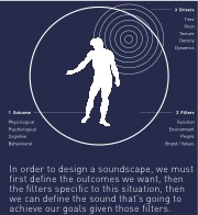
Form Follows Function
Mundane data research on global trends in health and economics comes to life in a vivid and beautiful form in the hands of Hans Rosling, a Swedish medical doctor, academic, statistician and public speaker. Rosling employs visuals of strikingly colorful circles that swell, shrink and migrate across the screen like living creatures to illustrate serious points about health policy and development. In his approach, Rosling fell back on an age-old design principle: find the right balance of form and function. Instead of using conventional approaches like bar charts or charts – which only served to make things more complicated and confusing – Rosling went instead to search for the right form – Lego bricks, boxes and customized software that swell, in some cases – that can bring realms of data to life.
Keep it Simple; Find Patterns
Another important design principle is to keep things simple. David McCandless, a data journalist and the author of “Information is Beautiful” is a master at applying this design principle in his use of Infographics, the combination of words and graphics to communicate a specific message. He finds simple, elegant ways to present complex data (like military spending) and information that might otherwise be too complex, big, small or abstract, for an audience to easily grasp. In his presentations, McCandless strips away irrelevant information to get at the core, and adds a layer of understanding by presenting things in context. For instance in his “The Billion Dollar Gram,” McCandless compares the $3 trillion spend on the Iraq War to: the cost to feed and educate every child on Earth for five years, the US Defense Budget, and the annual amount Americans give to charity. Seen in these relative terms the reader can grasp just how expensive the war was to the US.
The principles of design have evolved from a narrow discipline dealing with a product, building or structure, to become the guiding principle on how we can be more effective in the way we communicate, conduct presentations and approach consumer experiences.
How are you finding the principles of design affecting the way you do business?